Responsive
Website Design -
CSS Media Styles
Tutorial
Responsive Website Design
Creating a responsive website design is one of the best things you can do for your website this year!
Most business owners neglect the fact websites can be optimised to be viewed on mobile, tablets and other responsive devices. The benefits of having a responsive website are endless, and if you've been in the online business for a while, you'll know how hard it is to get returning customers to your website.
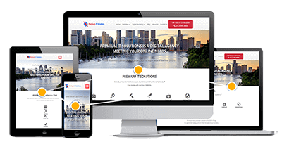
So, what happens if they come to your website on a mobile device? You better hope your website is responsive, otherwise you've just lost a customer! People don't realise, once a customer has been to your site, they are less likely to return if they had a bad experience the first time round. So, if your website isn't responsive, expect your customers to see things like this:
This could be happening more frequently than you realize, I bet you didn't know that almost 75% of your customers will reach your website off a mobile device.
Need Help Making your Website Responsive?
Responsive CSS Media Styles
Mobile Responsive Sizes
iPhone 4 and 4S
/*   Portrait and Landscape  */
@media only screen
and (min-device-width: 320px)
and (max-device-width: 480px)
and (-webkit-min-device-pixel-ratio: 2) {
}
/* Portrait */
@media only screen
and (min-device-width: 320px)
and (max-device-width: 480px)
and (-webkit-min-device-pixel-ratio: 2)
and (orientation: portrait) {
}
/* Landscape */
@media only screen
and (min-device-width: 320px)
and (max-device-width: 480px)
and (-webkit-min-device-pixel-ratio: 2)
and (orientation: landscape) {
}
iPhone 5 and 5S
/* ----------- iPhone 5 and 5S ----------- */
/* Portrait and Landscape */
@media only screen
and (min-device-width: 320px)
and (max-device-width: 568px)
and (-webkit-min-device-pixel-ratio: 2) {
}
/* Portrait */
@media only screen
and (min-device-width: 320px)
and (max-device-width: 568px)
and (-webkit-min-device-pixel-ratio: 2)
and (orientation: portrait) {
}
/* Landscape */
@media only screen
and (min-device-width: 320px)
and (max-device-width: 568px)
and (-webkit-min-device-pixel-ratio: 2)
and (orientation: landscape) {
}
iPhone 6 and 6+
/* ----------- iPhone 6 ----------- */
/* Portrait and Landscape */
@media only screen
and (min-device-width: 375px)
and (max-device-width: 667px)
and (-webkit-min-device-pixel-ratio: 2) {
}
/* Portrait */
@media only screen
and (min-device-width: 375px)
and (max-device-width: 667px)
and (-webkit-min-device-pixel-ratio: 2)
and (orientation: portrait) {
}
/* Landscape */
@media only screen
and (min-device-width: 375px)
and (max-device-width: 667px)
and (-webkit-min-device-pixel-ratio: 2)
and (orientation: landscape) {
}
/* ----------- iPhone 6+ ----------- */
/* Portrait and Landscape */
@media only screen
and (min-device-width: 414px)
and (max-device-width: 736px)
and (-webkit-min-device-pixel-ratio: 3) {
}
/* Portrait */
@media only screen
and (min-device-width: 414px)
and (max-device-width: 736px)
and (-webkit-min-device-pixel-ratio: 3)
and (orientation: portrait) {
}
/* Landscape */
@media only screen
and (min-device-width: 414px)
and (max-device-width: 736px)
and (-webkit-min-device-pixel-ratio: 3)
and (orientation: landscape) {
}
HTC
/* ----------- HTC One ----------- */
/* Portrait and Landscape */
@media screen
and (device-width: 360px)
and (device-height: 640px)
and (-webkit-device-pixel-ratio: 3) {
}
/* Portrait */
@media screen
and (device-width: 360px)
and (device-height: 640px)
and (-webkit-device-pixel-ratio: 3)
and (orientation: portrait) {
}
/* Landscape */
@media screen
and (device-width: 360px)
and (device-height: 640px)
and (-webkit-device-pixel-ratio: 3)
and (orientation: landscape) {
}
Samsung Galaxy
/* ----------- Galaxy S3 ----------- */
/* Portrait and Landscape */
@media screen
and (device-width: 320px)
and (device-height: 640px)
and (-webkit-device-pixel-ratio: 2) {
}
/* Portrait */
@media screen
and (device-width: 320px)
and (device-height: 640px)
and (-webkit-device-pixel-ratio: 2)
and (orientation: portrait) {
}
/* Landscape */
@media screen
and (device-width: 320px)
and (device-height: 640px)
and (-webkit-device-pixel-ratio: 2)
and (orientation: landscape) {
}
/* ----------- Galaxy S4 ----------- */
/* Portrait and Landscape */
@media screen
and (device-width: 320px)
and (device-height: 640px)
and (-webkit-device-pixel-ratio: 3) {
}
/* Portrait */
@media screen
and (device-width: 320px)
and (device-height: 640px)
and (-webkit-device-pixel-ratio: 3)
and (orientation: portrait) {
}
/* Landscape */
@media screen
and (device-width: 320px)
and (device-height: 640px)
and (-webkit-device-pixel-ratio: 3)
and (orientation: landscape) {
}
/* ----------- Galaxy S5 ----------- */
/* Portrait and Landscape */
@media screen
and (device-width: 360px)
and (device-height: 640px)
and (-webkit-device-pixel-ratio: 3) {
}
/* Portrait */
@media screen
and (device-width: 360px)
and (device-height: 640px)
and (-webkit-device-pixel-ratio: 3)
and (orientation: portrait) {
}
/* Landscape */
@media screen
and (device-width: 360px)
and (device-height: 640px)
and (-webkit-device-pixel-ratio: 3)
and (orientation: landscape) {
}
Tablet Responsive Sizes
iPad
/* ----------- iPad mini ----------- */
/* Portrait and Landscape */
@media only screen
and (min-device-width: 768px)
and (max-device-width: 1024px)
and (-webkit-min-device-pixel-ratio: 1) {
}
/* Portrait */
@media only screen
and (min-device-width: 768px)
and (max-device-width: 1024px)
and (orientation: portrait)
and (-webkit-min-device-pixel-ratio: 1) {
}
/* Landscape */
@media only screen
and (min-device-width: 768px)
and (max-device-width: 1024px)
and (orientation: landscape)
and (-webkit-min-device-pixel-ratio: 1) {
}
/* ----------- iPad 1 and 2 ----------- */
/* Portrait and Landscape */
@media only screen
and (min-device-width: 768px)
and (max-device-width: 1024px)
and (-webkit-min-device-pixel-ratio: 1) {
}
/* Portrait */
@media only screen
and (min-device-width: 768px)
and (max-device-width: 1024px)
and (orientation: portrait)
and (-webkit-min-device-pixel-ratio: 1) {
}
/* Landscape */
@media only screen
and (min-device-width: 768px)
and (max-device-width: 1024px)
and (orientation: landscape)
and (-webkit-min-device-pixel-ratio: 1) {
}
/* ----------- iPad 3 and 4 ----------- */
/* Portrait and Landscape */
@media only screen
and (min-device-width: 768px)
and (max-device-width: 1024px)
and (-webkit-min-device-pixel-ratio: 2) {
}
/* Portrait */
@media only screen
and (min-device-width: 768px)
and (max-device-width: 1024px)
and (orientation: portrait)
and (-webkit-min-device-pixel-ratio: 2) {
}
/* Landscape */
@media only screen
and (min-device-width: 768px)
and (max-device-width: 1024px)
and (orientation: landscape)
and (-webkit-min-device-pixel-ratio: 2) {
}
Galaxy Tablet
/* ----------- Galaxy Tab 10.1 ----------- */
/* Portrait and Landscape */
@media
(min-device-width: 800px)
and (max-device-width: 1280px) {
}
/* Portrait */
@media
(max-device-width: 800px)
and (orientation: portrait) {
}
/* Landscape */
@media
(max-device-width: 1280px)
and (orientation: landscape) {
}
HD Laptop Displays
Laptops
/* ----------- Non-Retina Screens ----------- */
@media screen
and (min-device-width: 1200px)
and (max-device-width: 1600px)
and (-webkit-min-device-pixel-ratio: 1) {
}
/* ----------- Retina Screens ----------- */
@media screen
and (min-device-width: 1200px)
and (max-device-width: 1600px)
and (-webkit-min-device-pixel-ratio: 2)
and (min-resolution: 192dpi) {
}
